Climate-Driven Dengue on a Spatial Grid: A Reaction–Diffusion Model with Temperature-Dependent Mosquito Ecology, $R_0$ Fields, and Vaccination Allocation
Published:
It was winter in Macau, and the temperature hovered around 25 degrees Celsius—hardly what you’d expect for mosquito season. Yet there I was, getting bitten. That moment got me thinking: if mosquitoes are active in what should be their off-season, what does that mean for dengue transmission as climates continue to warm? How do these shifting thermal windows interact with the spatial patterns of human movement and the strategic allocation of limited vaccination resources?
This personal observation sparked the question that drives this project: How do temperature-driven mosquito dynamics interact with spatial spread and vaccination allocation to shape dengue burden over multi-year horizons?
This question sits at the intersection of several modeling challenges. Climate warming shifts the thermal windows where mosquitoes thrive, but these effects are not uniform across space—urban heat islands, elevation gradients, and seasonal cycles create heterogeneous risk landscapes. Meanwhile, human mobility patterns (local diffusion plus occasional long-range jumps) determine how quickly infections spread from hotspots. And when vaccination resources are limited, the spatial allocation strategy—whether uniform, density-targeted, or climate-adaptive—can dramatically alter epidemic trajectories.
This post presents a technical walkthrough of the dengue_climate_model project, which couples these mechanisms into a single spatiotemporal framework. We’ll walk through the mathematical model (with full derivations), the numerical scheme and verification checks that ensure numerical sanity, and a deep interpretation of the generated visualizations and experiment-matrix summaries. All figures shown here are generated by deterministic runs committed to the dengue_climate_model/results/ folder, so you can reproduce every plot and table.
What this project implements
The dengue_climate_model simulates a spatiotemporal dengue system over a 2D domain, coupling human infection dynamics, temperature-driven mosquito ecology, spatial movement, and vaccination allocation into a unified reaction–diffusion framework.
On the human side, we use a spatial SEIRV-type system with waning immunity. To avoid the common confusion where “cumulative attack rate” exceeds 1.0 (which happens when reinfections occur), we split susceptibles into two compartments: $S_0$ for never-infected individuals and $S_1$ for previously-infected individuals who have lost immunity. This history-split structure lets us define a clean “ever infected fraction” metric that is bounded in $[0,1]$ and interpretable as the fraction of the population that has been infected at least once.
Mosquito ecology is handled via a temperature-dependent equilibrium of a two-stage (aquatic/adult) system. Rather than evolving mosquito demography as a full PDE, we compute an analytic equilibrium at each time step based on the local temperature, then use this to define a suitability field $\rho(T)$ that scales mosquito abundance. This equilibrium assumption trades some biological realism for computational speed, but it’s a reasonable approximation when mosquito dynamics are fast relative to human epidemic timescales.
Spatial movement combines two operators: diffusion (local mixing) for all human compartments, plus an additional fat-tailed nonlocal dispersal operator for exposed and infectious humans. The diffusion term captures day-to-day local contacts, while the dispersal term models occasional long-range jumps (travel, migration) that can seed new outbreaks far from the source. Together, these create the characteristic “halo” patterns you’ll see in the prevalence maps—a dense core surrounded by a low-prevalence ring.
Vaccination enters as a spatial field $\nu(x,t)$ representing the per-day vaccination rate in each cell. We enforce a daily dose budget and implement three allocation strategies: uniform (proportional to susceptibles), high_density (weighted by population density), and climate_adaptive (targeting cells where $R_0(x,t) > 1$). The vaccination rate field feeds back into the force of infection via a susceptibility reduction factor, creating a spatially explicit intervention layer.
Finally, we compute diagnostic fields: a scalar $R_0(T,\nu)$ for interpretability and a spatial field $R_0(x,t)$ that varies across the domain. These aren’t intended as rigorous next-generation matrix calculations (we omit explicit mosquito incubation, for example), but rather as consistent proxies that help us understand where transmission is most intense and how vaccination allocation should be targeted.
In this post, we will:
- Derive the mathematical model from first principles, including the analytic mosquito equilibrium
- Walk through the numerical method and verification checks that ensure numerical sanity
- Interpret the spatiotemporal visualizations to understand how climate, mobility, and vaccination interact
- Present findings from a systematic experiment matrix across warming scenarios, forcing types, and vaccination strategies
Mathematical problem statement
Let $\Omega \subset \mathbb{R}^2$ be a square spatial domain, discretized into an $n\times n$ grid. Human state variables are densities (counts per cell) evolving over time $t$ (days). We write the model in continuous form first, then explain the discretization and time stepping.
State variables (humans)
We use a history-split susceptible/vaccinated structure that explicitly tracks infection history. This design choice solves a common modeling pitfall: when waning immunity allows reinfections, the naive “cumulative attack rate” (total infections divided by initial population) can exceed 1.0, which is confusing and not interpretable as a fraction. By splitting susceptibles into $S_0(x,t)$ (never-infected) and $S_1(x,t)$ (previously-infected, now susceptible again), we can cleanly define an “ever infected fraction” that is bounded in $[0,1]$ and represents the fraction of the population that has been infected at least once.
The full human state consists of seven compartments: $S_0$ and $S_1$ (susceptibles, split by history), $E(x,t)$ (exposed/latent), $I(x,t)$ (infectious), $R(x,t)$ (recovered/immune), $V_0(x,t)$ (vaccinated, never infected), and $V_1(x,t)$ (vaccinated, previously infected). The total human population in each cell is:
\[N(x) = S_0 + S_1 + E + I + R + V_0 + V_1\]In the implementation, $N(x)$ is fixed from a synthetic population density surface. Births balance natural deaths to keep the global population approximately constant over the simulation horizon, which is a reasonable approximation for multi-year epidemic modeling where demographic turnover is slow relative to epidemic dynamics.
State variables (mosquito infection)
We track infected adult mosquitoes $I_m(x,t)$ as a state variable, but total adult mosquito abundance $M(x,t)$ is treated as quasi-equilibrated to temperature rather than evolved dynamically as a PDE. This is a key modeling assumption: we assume mosquito demography (egg laying, maturation, mortality) operates on fast timescales relative to human epidemic dynamics, so the mosquito population quickly reaches equilibrium for any given temperature. This equilibrium assumption lets us compute $M(x,t)$ at each time step as:
\[M(x,t) = m_0\, \rho(T(x,t)) \, N(x)\]where $m_0$ is a baseline mosquito-to-human ratio at peak suitability, and $\rho(T)$ is a temperature-dependent suitability function (derived below) that scales from 0 to 1. The susceptible mosquito pool is then $S_m(x,t) = \max(M(x,t) - I_m(x,t), 0)$, ensuring we never have more infected mosquitoes than total mosquitoes.
Climate forcing: the temperature field $T(x,t)$
The model uses a temperature field composed of:
\[T(x,t) = T_{\text{mean}} + \Delta T_{\text{climate}} + A \cos\!\left(\frac{2\pi (t - t_{\text{peak}})}{365}\right) + \delta T_{\text{spatial}}(x)\]- $T_{\text{mean}}$: baseline mean temperature (°C)
- $A$: seasonal amplitude (°C)
- $t_{\text{peak}}$: day-of-year peak timing
- $\Delta T_{\text{climate}}$: scenario warming offset (0, +1.5, +2.5°C)
- $\delta T_{\text{spatial}}(x)$: deterministic, mean-zero spatial anomaly (gradient / bumps / mixed)
The ablations used in the experiment matrix are implemented via two booleans:
enable_seasonalitytoggles the cosine term.enable_spatial_heterogeneitytoggles $\delta T_{\text{spatial}}$.
Temperature-dependent mosquito ecology (with derivation)
The model defines four temperature-dependent mosquito demographic rates that control the two-stage life cycle. Egg laying $\theta(T)$ follows a Gaussian curve centered on an optimal temperature, reflecting the fact that mosquitoes lay the most eggs when conditions are ideal. Maturation $\sigma(T)$ is piecewise linear and drops to zero outside the range [15, 35]°C, capturing the thermal limits beyond which aquatic-stage mosquitoes cannot develop into adults. Aquatic mortality $\mu_A(T)$ increases exponentially with temperature, representing stress on developing mosquitoes. Adult mortality $\mu_M(T)$ also increases exponentially, with an additional heat penalty above 35°C that models heat-induced mortality. These functional forms are based on empirical relationships from the vector ecology literature, though the specific parameter values used here are synthetic for demonstration purposes.
Two-stage mosquito system
The mosquito life cycle is modeled as a two-stage system: aquatic-stage mosquitoes $A(t)$ (eggs, larvae, pupae) and adult mosquitoes $M(t)$. The dynamics are:
\[\begin{aligned} \frac{dA}{dt} &= \theta(T) M - \big(\sigma(T) + \mu_A(T)\big)A - \frac{A^2}{K_A}\\ \frac{dM}{dt} &= \sigma(T)A - \mu_M(T)M \end{aligned}\]The first equation says that aquatic-stage mosquitoes increase through egg laying (proportional to adult abundance and the temperature-dependent rate $\theta(T)$), decrease through maturation into adults (rate $\sigma(T)$) and mortality (rate $\mu_A(T)$), and experience density-dependent competition via the quadratic term $\frac{A^2}{K_A}$ where $K_A$ is a carrying capacity. The second equation says that adult mosquitoes increase through maturation from the aquatic stage and decrease through mortality (rate $\mu_M(T)$). This is a standard two-stage model used in vector ecology, with the key innovation being that all rates are temperature-dependent.
Analytic equilibrium $(A^, M^)$
At equilibrium, $\frac{dM}{dt}=0$ gives:
\[M^* = \frac{\sigma(T)}{\mu_M(T)} A^*\]Substitute into $\frac{dA}{dt}=0$:
\[0 = \theta(T)\frac{\sigma(T)}{\mu_M(T)}A^* - \big(\sigma(T)+\mu_A(T)\big)A^* - \frac{(A^*)^2}{K_A}\]Factor out $A^*$:
\[0 = A^* \left[\theta(T)\frac{\sigma(T)}{\mu_M(T)} - \big(\sigma(T)+\mu_A(T)\big) - \frac{A^*}{K_A}\right]\]So either $A^*=0$ (extinction) or:
\[\frac{A^*}{K_A} = \theta(T)\frac{\sigma(T)}{\mu_M(T)} - \big(\sigma(T)+\mu_A(T)\big)\]Define the net “growth surplus” term:
\[g(T) = \theta(T)\frac{\sigma(T)}{\mu_M(T)} - \big(\sigma(T)+\mu_A(T)\big)\]Then:
\[A^*(T) = K_A \max(g(T),0),\qquad M^*(T) = \frac{\sigma(T)}{\mu_M(T)} A^*(T)\]This analytic solution is exactly what the code computes in src/dengue_model.py (solve_mosquito_equilibrium()). The key insight is that when $g(T) \leq 0$, the growth surplus is non-positive, meaning the population cannot sustain itself and goes extinct ($A^* = M^* = 0$). This happens when temperatures are too cold (maturation fails) or too hot (mortality dominates). The equilibrium assumption makes the full simulation vastly faster than numerically integrating mosquito ODEs at every time step, which is crucial for multi-year simulations over large spatial grids.
Suitability $\rho(T)$
The suitability function $\rho(T)$ is a normalized proxy for how favorable a given temperature is for mosquito population growth. It’s defined as:
\[\rho(T)=\frac{M^*(T)}{M^*(T_{\text{ref}})}\]clipped to $[0,1]$, where $T_{\text{ref}}$ is a reference temperature. In the code, $T_{\text{ref}} = T_{\text{opt}}$ (the egg-laying optimum), so $\rho(T)$ measures mosquito abundance relative to the peak possible abundance. This function peaks at the optimal temperature and drops off as temperatures move away from the optimum, creating the thermal windows that drive spatial and temporal heterogeneity in transmission risk.
Transmission coupling and force of infection
Temperature-driven biting and transmission rates
The temperature-dependent biting rate captures how mosquito feeding activity changes with temperature. It’s defined as:
\[b(T) = \begin{cases} b_0 \exp(k_b(T-25)), & 15\le T\le 35\\ 0, & \text{otherwise} \end{cases}\]This exponential form means biting activity increases rapidly as temperature rises from 15°C toward 25°C, then continues increasing (though the rate of increase slows) up to 35°C. Beyond 35°C, biting stops entirely, representing heat stress that prevents mosquito activity. The functional form is based on empirical relationships showing that mosquito feeding rates are highly temperature-sensitive.
The project then defines two coupling terms that connect mosquito and human infection dynamics. The mosquito-to-human coupling proxy is:
\[\beta_h(T,M,N_h) = b(T)\,\alpha\,p_h\,\frac{M}{N_h}\]where $\alpha$ is a contact scaling factor and $p_h$ is the probability of transmission from mosquito to human per bite. The $\frac{M}{N_h}$ term normalizes by human population density, creating a “per human” contact rate. The human-to-mosquito coupling is simpler:
\[\beta_m(T) = b(T)\,p_m\]where $p_m$ is the probability of transmission from human to mosquito per bite. These coupling terms are implemented in beta_h() and beta_m() and their vectorized equivalents, allowing us to compute spatially varying transmission rates based on local temperature and mosquito abundance.
Human infection term (as implemented)
In the simulation loop, the new-exposure flux (force of infection) is computed as:
\[\lambda_h(x,t) = \beta_h(T(x,t),M(x,t),N(x))\,\frac{S(x,t)\,I_m(x,t)}{N(x)}\]where $S = S_0 + S_1$ is the total susceptible pool (combining never-infected and previously-infected susceptibles). This is a deliberately simplified “mass-action” form used for synthetic experiments. The key assumption is that the rate of new human infections is proportional to the product of susceptible humans and infected mosquitoes, normalized by total population. This form is consistent with the code path in run_simulation() where beta_h_field already contains the $\frac{M}{N}$ normalization, and the infection term divides by $N$ again to create a per-capita rate. For a data-calibrated model, you might want to replace this with a more sophisticated contact function (e.g., frequency-dependent or network-based), but for mechanism exploration, this mass-action form is sufficient and interpretable.
Mosquito infection term
Mosquito infection is modeled as a simple SI (susceptible-infected) process over a fixed adult abundance field $M(x,t)$. The dynamics are:
\[\frac{dI_m}{dt} = \beta_m(T)\,\frac{S_m(x,t)\,I(x,t)}{N(x)} - \mu_M(T)\,I_m(x,t)\]where $S_m = \max(M-I_m,0)$ is the susceptible mosquito pool (total mosquitoes minus infected mosquitoes). The first term represents new mosquito infections, which occur when susceptible mosquitoes bite infectious humans. The rate is proportional to the temperature-dependent biting rate $\beta_m(T)$, the density of infectious humans $\frac{I(x,t)}{N(x)}$, and the susceptible mosquito pool. The second term represents loss of infected mosquitoes through mortality at rate $\mu_M(T)$. Note that we don’t model mosquito recovery (mosquitoes remain infected for life), which is a reasonable approximation for dengue vectors. The key simplification here is that we treat mosquito infection as a fast process relative to human epidemic dynamics, so $I_m$ quickly equilibrates to the current human infectious pool.
Human PDE system (reaction + diffusion + nonlocal dispersal)
Reaction terms (ODE part)
Let $\nu(x,t)$ be the per-day vaccination rate applied to susceptibles (allocated subject to a dose budget). Births balance deaths with:
\[\Lambda(x) = \mu_h N(x)\]Then the history-split human dynamics are:
\[\begin{aligned} \frac{\partial S_0}{\partial t} &= \Lambda - \lambda_{h,0} - (\mu_h+\nu)S_0\\ \frac{\partial S_1}{\partial t} &= \omega R - \lambda_{h,1} - (\mu_h+\nu)S_1\\ \frac{\partial E}{\partial t} &= \lambda_h - (\mu_h+\sigma_h)E\\ \frac{\partial I}{\partial t} &= \sigma_h E - (\mu_h+\gamma_h)I\\ \frac{\partial R}{\partial t} &= \gamma_h I - (\mu_h+\omega)R\\ \frac{\partial V_0}{\partial t} &= \nu S_0 - \mu_h V_0\\ \frac{\partial V_1}{\partial t} &= \nu S_1 - \mu_h V_1 \end{aligned}\]with $\lambda_{h,0}$ and $\lambda_{h,1}$ applying the same infection functional form separately to $S_0$ and $S_1$.
Diffusion (local mixing)
Each human compartment receives a diffusion term that models local spatial mixing:
\[\frac{\partial U}{\partial t}\Big|_{\text{diff}} = D_U \nabla^2 U\]where $D_U$ is a compartment-specific diffusion coefficient and $\nabla^2$ is the Laplacian operator. This term captures day-to-day local movement: people interact with neighbors, commute short distances, and generally mix within their local area. The diffusion creates smooth spatial gradients, so if there’s a hotspot of infection, it will gradually spread outward as a wave. We use no-flux (Neumann) boundary conditions, meaning the domain is closed and no one enters or leaves at the edges. In the code, the 5-point Laplacian (standard finite-difference stencil) uses edge padding to handle boundary conditions efficiently.
Nonlocal dispersal (fat-tailed mixing) for $E$ and $I$
Exposed and infectious humans also receive a nonlocal dispersal operator that models occasional long-range jumps:
\[\mathcal{L}[u](x) = \int_{\Omega} K(y)\,[u(x-y)-u(x)]\,dy\]This operator redistributes individuals according to a kernel $K$ that has a fat tail, meaning it allows for occasional long-distance movement. The integral form says: at each location $x$, we take individuals from all other locations $y$ (weighted by $K(x-y)$) and subtract the individuals leaving $x$ (weighted by the total kernel mass). This is implemented computationally as:
\[\mathcal{L}[u] \approx (K * u) - \left(\int K\right)u\]where $*$ denotes convolution. The convolution $(K * u)$ represents individuals arriving from elsewhere, while $\left(\int K\right)u$ represents individuals leaving the current location. The kernel is a normalized fat-tailed distribution with scale $L$ and mass $\kappa$:
\[K(r) \propto \left(1+\frac{r^2}{L^2}\right)^{-3/2}\]This power-law form means that while most movement is local (near $r=0$), there’s a non-negligible probability of very long jumps. This captures real-world mobility patterns where people mostly stay local but occasionally travel long distances (e.g., for work, family visits, or migration). The key property is that this construction makes $\sum_x \mathcal{L}u\approx 0$, i.e., it’s a mass-conserving redistribution operator (validated in unit tests). This means the nonlocal dispersal doesn’t create or destroy individuals, it just moves them around, which is essential for maintaining population conservation.
$R_0(T,\nu)$ and the spatial $R_0(x,t)$ field
Scalar $R_0(T,\nu)$
The project uses a simplified next-generation form for the basic reproduction number:
\[R_0(T,\nu)=\sqrt{\frac{\beta_h(T)\,\beta_m(T)\,\sigma_h\,f_{\text{susc}}(\nu)}{(\mu_h+\sigma_h)(\mu_h+\gamma_h)\,\mu_M(T)}}\]This form captures the key dependencies: transmission rates ($\beta_h$, $\beta_m$), human progression through exposed and infectious stages ($\sigma_h$, $\gamma_h$), human mortality ($\mu_h$), mosquito mortality ($\mu_M(T)$), and vaccination via a susceptibility reduction factor:
\[f_{\text{susc}}(\nu)=1-\frac{\nu}{\mu_h+\nu}\in[0,1]\]This vaccination factor represents the fraction of susceptibles that remain unvaccinated in steady state, accounting for the fact that vaccination removes people from the susceptible pool at rate $\nu$ while natural mortality removes them at rate $\mu_h$. When $\nu$ is large relative to $\mu_h$, most susceptibles get vaccinated, so $f_{\text{susc}}(\nu)$ approaches 0 and $R_0$ drops.
It’s important to note that this is not intended as a full mechanistic vector-borne $R_0$ derivation (e.g., it omits explicit mosquito incubation, which would add another delay). Rather, it’s a consistent scalar proxy used for strategy targeting and interpretability. The square root form comes from the fact that transmission requires two steps (human→mosquito and mosquito→human), so the effective $R_0$ is the geometric mean of the two directional transmission potentials.
Field $R_0(x,t)$
The field version vectorizes the same idea but uses local values for mosquito abundance, temperature, and vaccination:
\[R_0(x,t)=\sqrt{\frac{\beta_h(x,t)\,\beta_m(x,t)\,\sigma_h\,f_{\text{susc}}(\nu(x,t))}{(\mu_h+\sigma_h)(\mu_h+\gamma_h)\,\mu_M(T(x,t))}}\]This creates a spatial map of transmission potential that varies across the domain. Cells with high $R_0(x,t)$ are hotspots where an outbreak would grow rapidly, while cells with $R_0(x,t) < 1$ are coldspots where transmission cannot sustain itself. This field is used in two ways: first, in the visualization panels to show where transmission risk is highest (the third row of the spatiotemporal plots), and second, in the climate_adaptive vaccination allocation strategy, which targets cells where $R_0(x,t) > 1$ to maximize the impact of limited vaccine doses.
Vaccination allocation: turning doses into $\nu(x,t)$
Vaccination allocation converts a fixed annual dose budget into a spatial field $\nu(x,t)$ representing the per-day vaccination rate in each cell. The daily dose budget is simply:
\[D_{\text{day}} = \frac{D_{\text{annual}}}{365}\]We allocate doses as “people vaccinated per day per cell,” proportional to strategy-specific weights $w(x)$, then convert to a per-day vaccination rate:
\[\text{alloc}(x) = D_{\text{day}}\frac{w(x)}{\sum_y w(y)},\qquad \nu(x)=\min\!\left(\nu_{\max},\frac{\text{alloc}(x)}{S(x)+\varepsilon}\right)\]The first equation distributes the daily budget across cells proportionally to weights, ensuring the total daily allocation equals $D_{\text{day}}$. The second equation converts allocation into a vaccination rate by dividing by the susceptible pool $S(x)$ (with a small $\varepsilon$ to avoid division by zero), then clips to a maximum rate $\nu_{\max}$ to respect operational constraints.
The weights $w(x)$ differ by strategy, creating distinct spatial patterns. The uniform strategy uses $w(x)=S(x)$, allocating proportionally to susceptibles everywhere, which tends to produce a near-uniform $\nu$ field after normalization. The high_density strategy uses $w(x)=\text{dens}(x)\,S(x)$, weighting by population density, which concentrates vaccination in urban cores. The climate_adaptive strategy uses $w(x)=\max(R_0(x,t)-1,0)\,S(x)$, targeting only cells where $R_0 > 1$ (i.e., where transmission can sustain itself), which creates a risk-targeted allocation pattern. If all weights are zero (e.g., if $R_0 \leq 1$ everywhere), the strategy falls back to uniform allocation.
Numerical method and verification (what makes the synthetic story credible)
Operator splitting (what actually runs)
The numerical scheme uses operator splitting to handle the different types of terms in the PDE system. Each time step $dt$ proceeds through five stages:
First, a reaction step applies RK4 (fourth-order Runge-Kutta) to the stacked state vector $[S_0,S_1,E,I,R,V_0,V_1,I_m]$. This handles all the ODE terms: births, deaths, infection, progression through disease stages, waning immunity, and vaccination. RK4 provides high accuracy for the nonlinear reaction terms while maintaining stability.
Second, incidence accumulation updates the cumulative_cases counter from the beginning-of-step infection rate. This is computed before the reaction step modifies the state, ensuring monotonicity (cumulative cases can only increase) and avoiding double-counting.
Third, a diffusion step applies explicit Euler to each human compartment. This is a simple forward Euler update: $U^{n+1} = U^n + dt \cdot D_U \nabla^2 U^n$. Explicit Euler is stable as long as the time step satisfies a CFL condition ($dt < \frac{dx^2}{2D_U}$), which we enforce in the parameter validation.
Fourth, nonlocal dispersal (if $\kappa>0$) applies the fat-tailed redistribution operator to exposed and infectious humans. This is implemented efficiently using FFT convolution: we compute $(K * u)$ in Fourier space, then subtract the local term to get the full operator. The FFT approach scales as $O(N \log N)$ rather than $O(N^2)$, making it feasible for large grids.
Fifth, a projection step enforces physical constraints: all compartments are clamped to non-negative values, and global population conservation is enforced by renormalization. If the population drift is too large (indicating a numerical instability), the simulation hard-fails with an error message. This projection ensures that numerical errors don’t create unphysical states (negative populations or mass loss).
This operator-splitting approach is standard for reaction-diffusion systems and allows us to use specialized methods for each type of term. The key assumption is that the splitting error (the difference between the split and fully coupled updates) is small relative to the discretization error, which is reasonable when $dt$ is small.
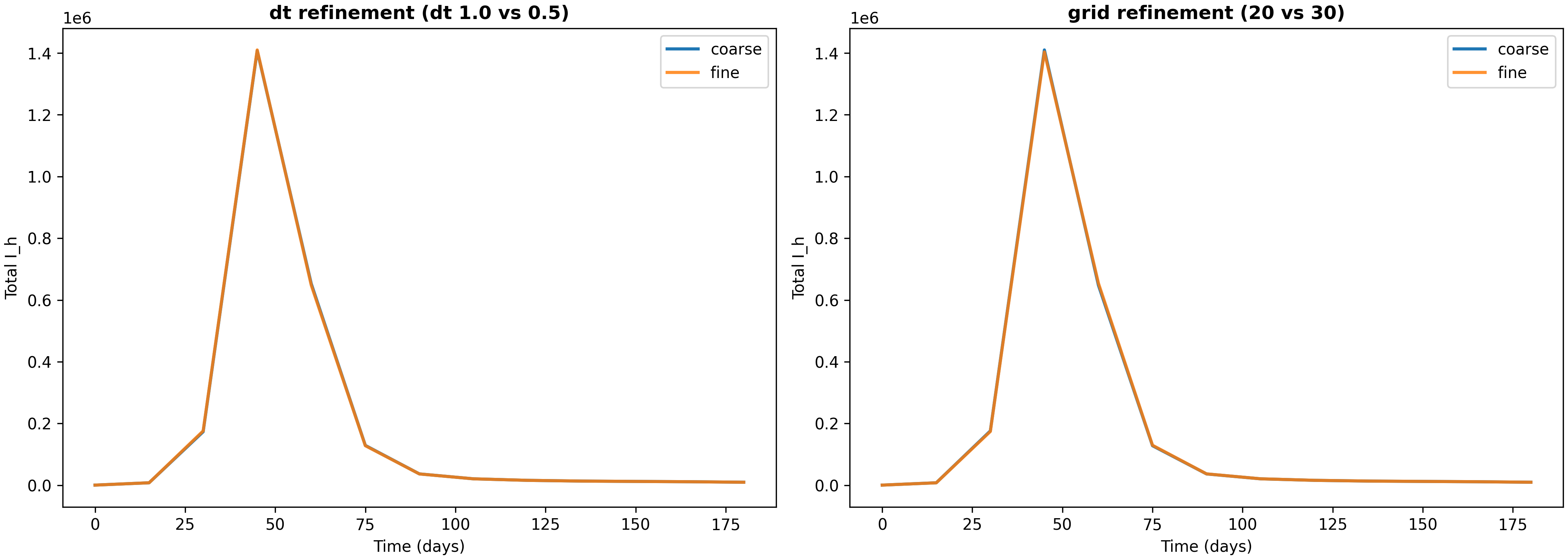
Verification evidence (dt and grid refinement)
To ensure that our numerical results are not artifacts of discretization choices, we run refinement studies that compare solutions at different time steps and grid resolutions. The script verify_numerics.py produces a report and comparison plot (available at results/verification-baseline-uniform-20251226-184346/verification_report.json and verification_totals.png).
In a verification run over a 180-day horizon, we compared solutions with different discretization parameters. For time step refinement (reducing $dt$ from 1.0 to 0.5 days), the relative $L_2$ error in the infectious human time series is approximately $1.19\times10^{-3}$, and the relative difference in final cumulative infections per capita is approximately $1.37\times10^{-3}$. For grid refinement (increasing grid resolution from 20×20 to 30×30), the relative $L_2$ error is approximately $1.87\times10^{-3}$, and the relative difference in final cumulative infections per capita is approximately $1.45\times10^{-4}$.
These errors are small (on the order of 0.1% to 0.2%), which gives us confidence that the discretization is adequate for the questions we’re asking. The fact that grid refinement produces smaller differences than time step refinement suggests that spatial discretization is not the limiting factor—the time step is the primary source of numerical error. This is the kind of “numerical sanity” evidence a methods-oriented blog (and later paper) needs: not a full convergence proof, but a concrete check that key totals are not artifacts of a particular discretization choice. The verification plot shows these comparisons visually, making it easy to see that the solutions are converging as we refine the discretization.
Visualization deep dive (how to read the figures)
The spatiotemporal plots in this project are designed with a key principle: color is comparable across time points. This means that if you see the same color in two different snapshots, it represents the same value, not a rescaled value. This design choice is crucial for interpreting temporal evolution—you can immediately see whether prevalence is increasing or decreasing, whether temperature is rising or falling, and whether vaccination intensity is changing over time.
To achieve this comparability, we use fixed color scales for temperature $T$ and $R_0$ across all four snapshots shown. Prevalence is plotted on a log scale ($\log_{10}(I_h/N_h)$), which is essential because prevalence can span many orders of magnitude (from $10^{-6}$ in uninfected regions to $10^{-1}$ in hotspots). The log scale lets you see both the dense core and the low-prevalence “halo” simultaneously. Vaccination $\nu(x,t)$ is plotted as a fourth row (or population density if $\nu$ is absent), providing context for how intervention intensity varies across space and time.
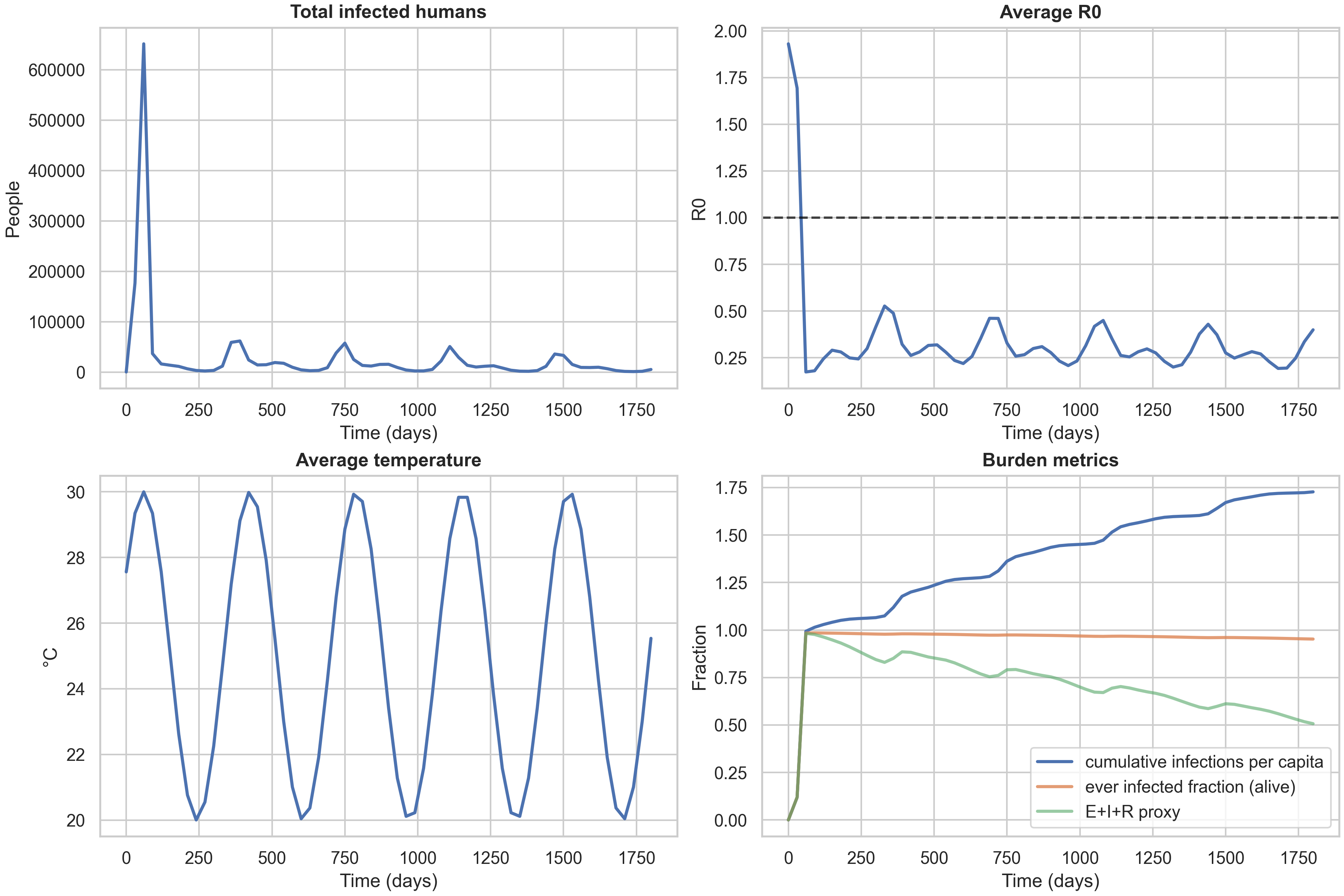
1) Baseline spatiotemporal panel: what the rows mean
The baseline spatiotemporal panel shows how the epidemic evolves over a 5-year horizon under uniform vaccination allocation. This is our reference case, against which we compare targeted strategies.
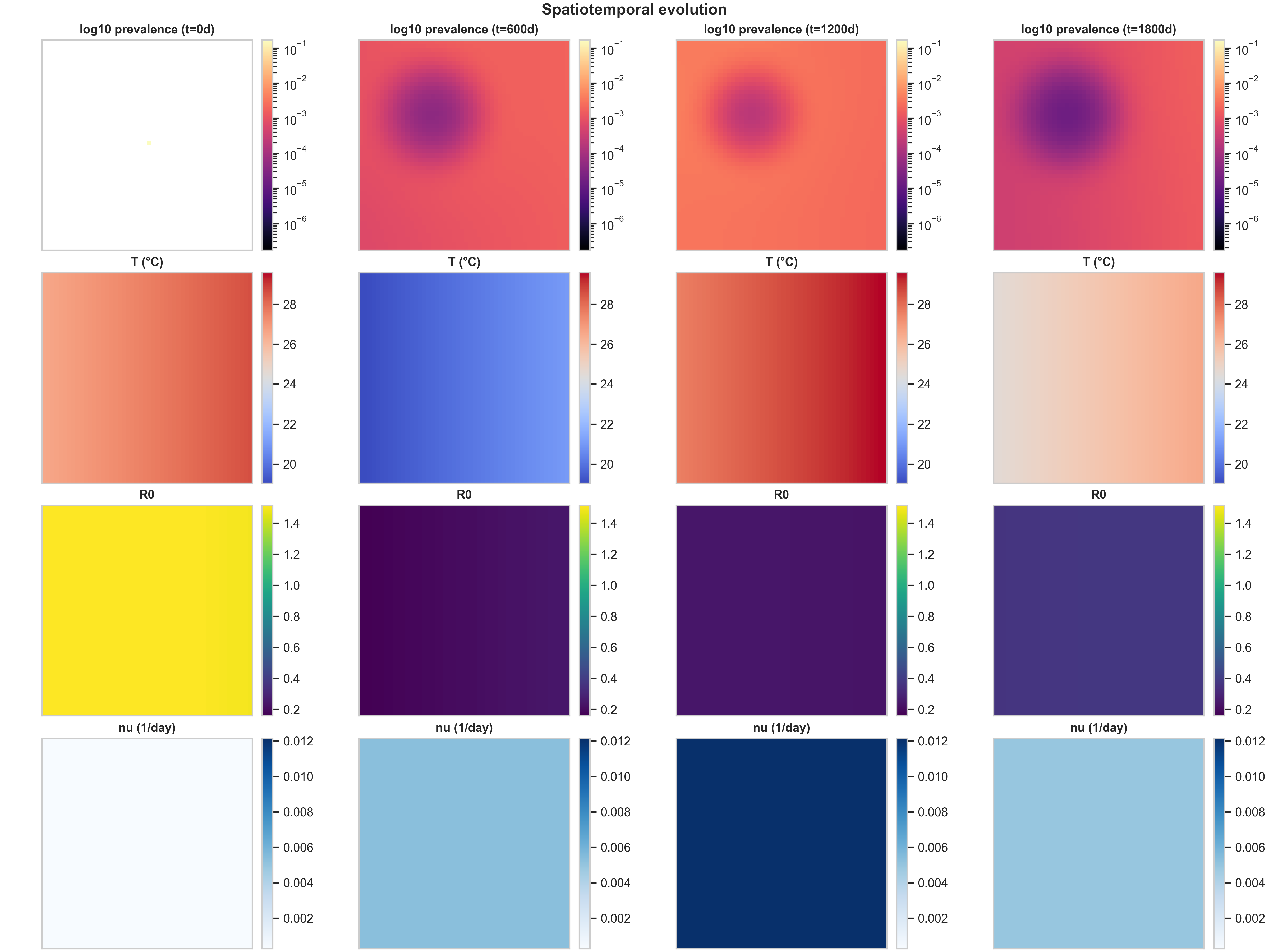
Row 1 (log10 prevalence) shows the spatial spread of infection. At $t=0$, there’s a tiny seed of infection (a faint yellow dot near the center). By $t=600$ days, this has grown into a prominent circular region of high prevalence (dark purple, around $10^{-1}$) surrounded by concentric rings of decreasing prevalence. The log scale is essential here: it reveals both the dense core (where prevalence is high) and the low-prevalence “halo” created by diffusion and fat-tailed dispersal. As time progresses, the central high-prevalence region expands and intensifies, while the halo extends toward the domain edges. This pattern is characteristic of reaction-diffusion systems with a localized initial condition: the infection spreads outward as a wave, but the core remains the most intense because that’s where the outbreak started and where susceptible depletion is slowest.
Row 2 (Temperature $T$) shows the spatial temperature field at each snapshot. The fixed color scaling makes seasonality immediately visible: at $t=0$ and $t=1200$ days, the map shows a gradient from warm (red, ~28°C) in the top-right to cool (blue, ~20°C) in the bottom-left. At $t=600$ and $t=1800$ days, the gradient reverses, indicating we’re in a different season. Without fixed color scaling, each panel would auto-rescale to its own min/max, making it impossible to compare temperatures across time. With fixed scaling, you can immediately see that “same color means same temperature” across all columns, making the seasonal cycle obvious.
Row 3 ($R_0$) shows the spatial field of transmission potential. This is a mechanistic proxy layer: it’s temperature-driven (via $\beta_h$, $\beta_m$, and $\mu_M$) and modulated by vaccination (via $f_{\text{susc}}(\nu)$). The spatial heterogeneity comes from two sources: the temperature anomaly $\delta T_{\text{spatial}}(x)$ and the population field via the $M/N$ scaling. In this baseline run, $R_0$ starts high (yellow, ~1.4) at $t=0$, then drops to low values (purple, ~0.2) as the epidemic progresses and vaccination takes effect. The fact that $R_0$ is uniform across space at later times reflects the uniform vaccination strategy: when everyone gets vaccinated at the same rate, the transmission potential becomes spatially homogeneous.
Row 4 ($\nu$) shows the vaccination rate field. Under the uniform strategy, doses are allocated proportionally to susceptibles, which—given the model’s mixing and the normalization/clipping steps—produces a near-uniform $\nu$ field. This row becomes much more informative under high_density and climate_adaptive strategies, where vaccination intensity varies dramatically across space.
2) Strategy comparison at the same scenario
Comparing the three vaccination strategies side-by-side reveals how spatial allocation patterns interact with epidemic dynamics. Below are the curated spatiotemporal plots for the other two strategies, both under the same baseline climate scenario:
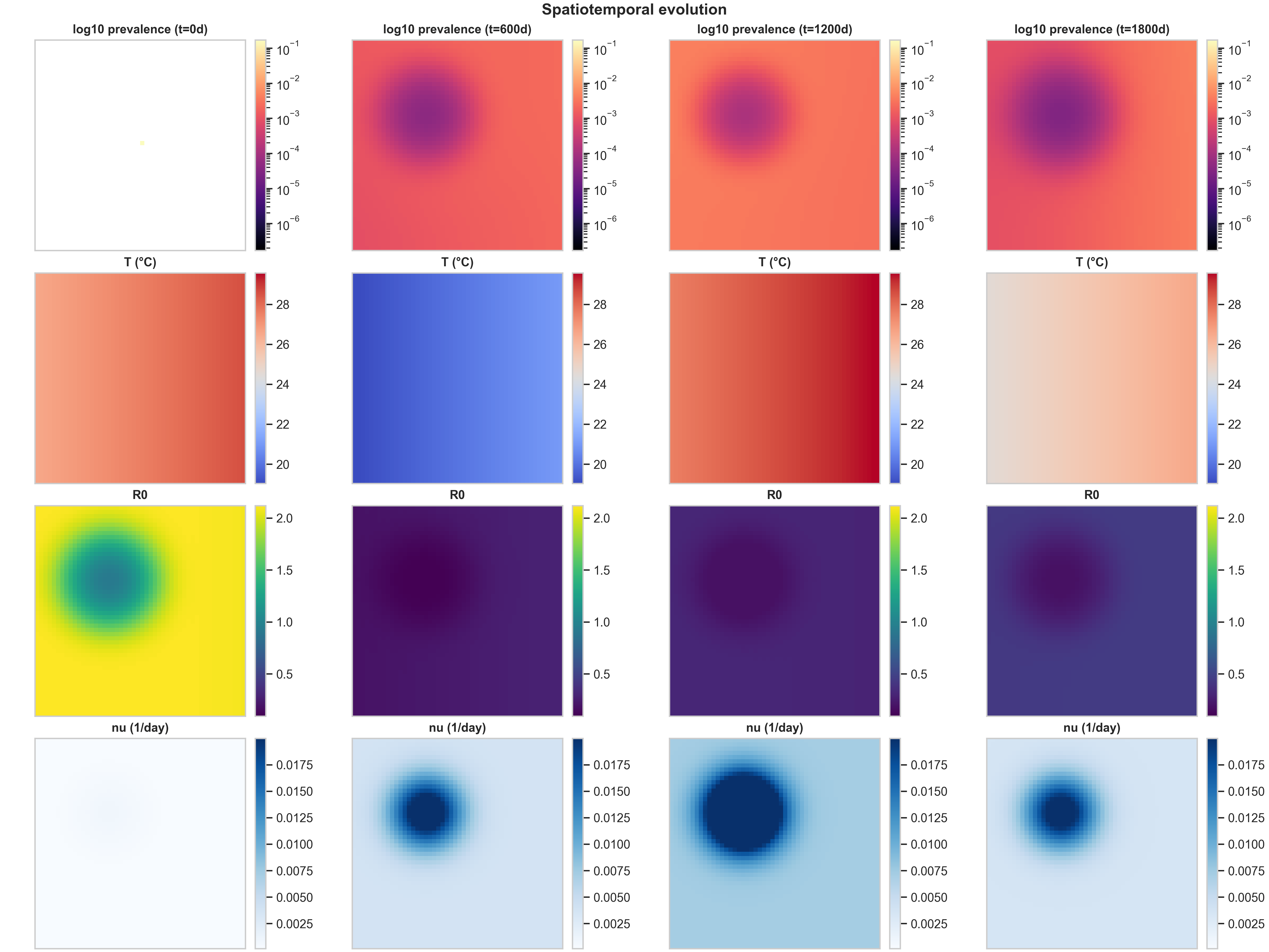
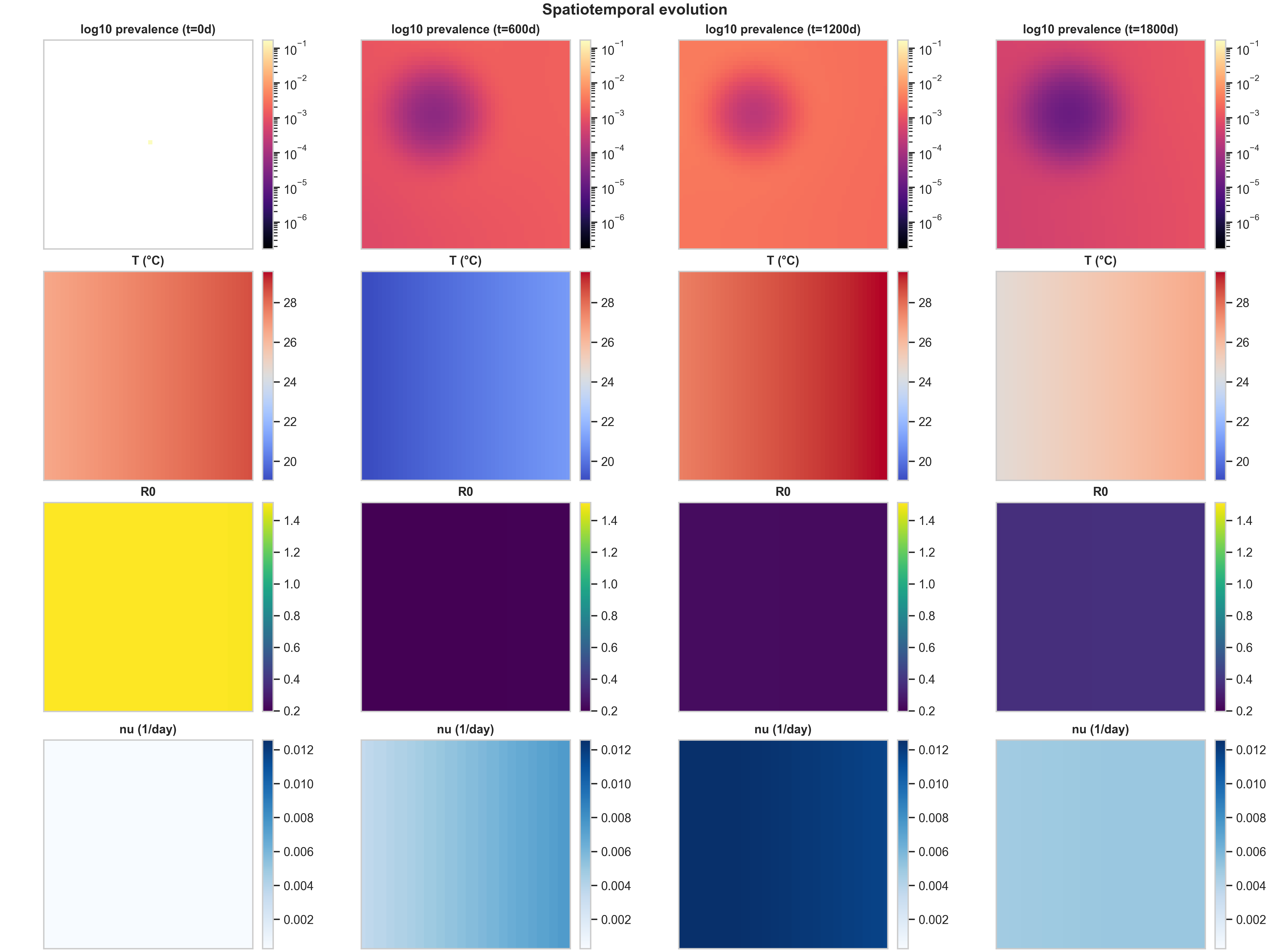
The most striking difference is in Row 4 ($\nu(x,t)$ structure). The high_density strategy produces the cleanest spatial signal: vaccination concentrates in the urban core (visible as a dark blue region in the bottom row), creating a visibly localized intervention footprint. This happens because high_density weights allocation by population density, so cells with more people receive more doses. The climate_adaptive strategy is more subtle in this baseline run because the spatial $R_0(x,t)$ field is only moderately heterogeneous; you mainly see a weak large-scale gradient in $\nu$, plus seasonal modulation as $R_0$ fluctuates with temperature.
The $R_0(x,t)$ response to intervention (Row 3) shows the mechanistic chain in action. In high_density, the strong $\nu$ hotspot locally suppresses $f_{\text{susc}}(\nu)$ (the fraction of susceptibles that remain unvaccinated), which shows up as a depressed $R_0$ region colocated with the intervention footprint. This is exactly the mechanistic chain we want a reader to see: temperature $T(x,t)$ drives biting rates $b(T)$, mortality $\mu_M(T)$, and suitability $\rho(T)$, which together determine mosquito abundance $M(x,t)$, which feeds into transmission potential $R_0(x,t)$, which guides vaccination allocation $\nu(x,t)$, which then feeds back to alter epidemic spread by reducing local transmission.
When evaluating prevalence vs $\nu$, the meaningful question is not “does the blob look different,” but whether targeted vaccination changes (i) peak prevalence (the maximum value in the core), (ii) the spatial extent above a threshold (how much area has prevalence > $10^{-3}$, for example), and (iii) the timing and amplitude of recurrent seasonal pulses. In these baseline settings, the three strategies produce similar prevalence patterns because the spatial heterogeneity is moderate and the dose budget is not extremely tight. The differences become more pronounced when you have stronger spatial gradients (e.g., sharper temperature anomalies) or tighter dose constraints.
3) Temporal diagnostics: avoiding misleading “attack rate”
The temporal dashboard provides a complementary view to the spatiotemporal panels, showing how aggregate metrics evolve over time. It displays four key quantities: total infected humans (showing seasonal epidemic pulses), average $R_0$ over time (a temperature-driven transmissibility proxy), average temperature over time (the seasonal cycle), and burden metrics that track cumulative impact.

The burden metrics panel is particularly important because it highlights a common modeling pitfall. The cumulative_infections_per_capita metric can exceed 1.0, which might look like a bug but is actually correct: it represents the total number of infections per person over the simulation, and with waning immunity ($R \to S_1$), people can be infected multiple times. The ever_infected_fraction metric is bounded in $[0,1]$ and represents the fraction of the population that has been infected at least once among those still alive. This is the correct “unique burden” metric and should be used for any statement resembling “attack rate” in a paper or blog context. The third metric, ever_infected_proxy (computed as $(E+I+R)/N$), can decrease with waning because it tracks the fraction currently in an exposed, infectious, or recovered state, which shrinks as people lose immunity and return to susceptibility.
For context, here are the same temporal dashboards for the other two strategies:
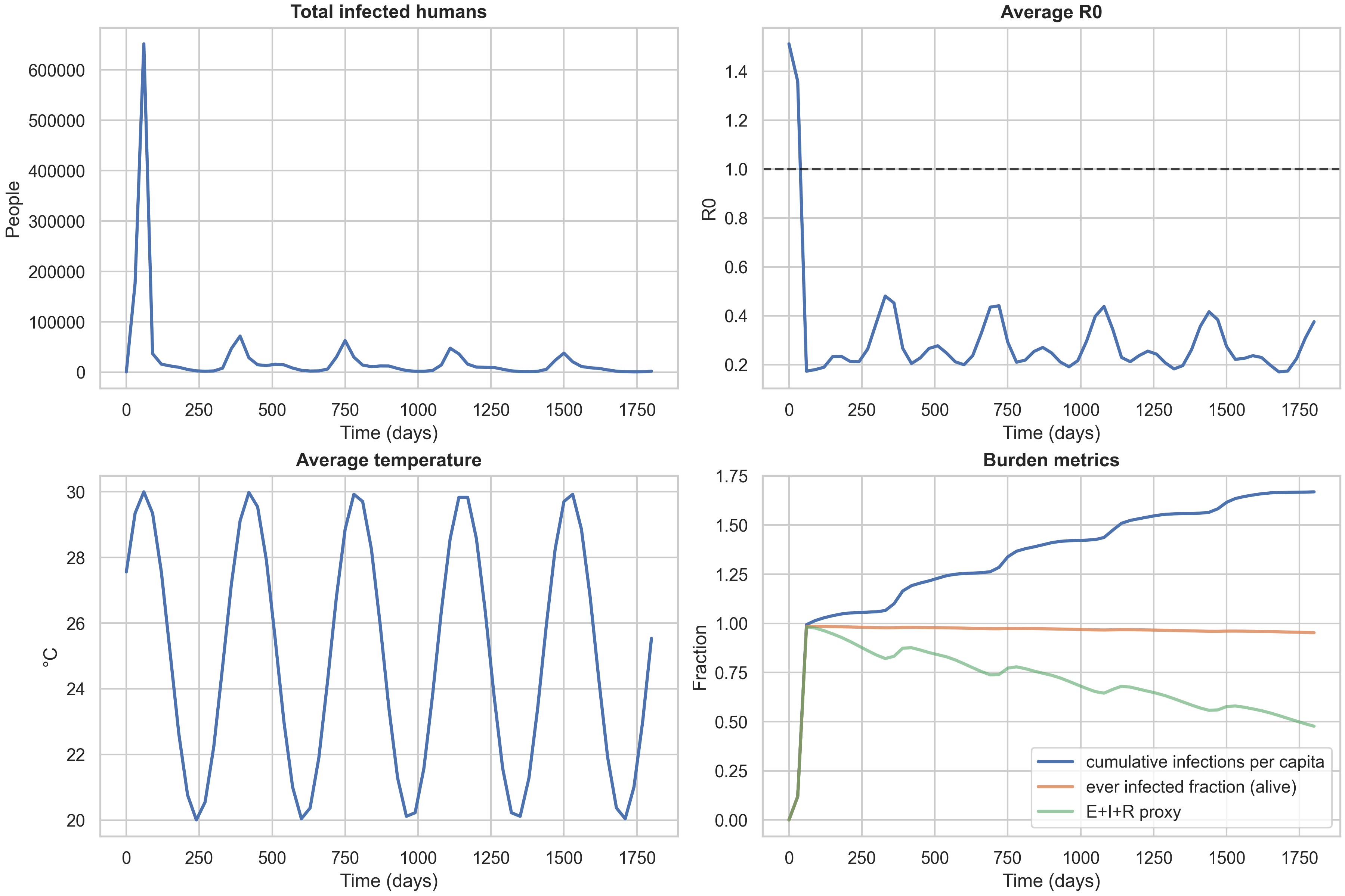
A key observation is that the three strategy curves nearly overlap in these baseline settings. This is informative: it tells us that with high mixing (both diffusion and fat-tailed dispersal) and moderate spatial heterogeneity, the allocation rule has limited leverage. The differences between strategies become more pronounced when you have (i) tighter dose constraints (forcing harder trade-offs), (ii) sharper risk landscapes (e.g., stronger $\delta T_{\text{spatial}}$ creating more pronounced hotspots), or (iii) different mobility regimes (e.g., less long-range dispersal, making local targeting more effective). This is a useful “methods lesson” for anyone designing spatial intervention strategies: you need both heterogeneity and a binding constraint to see strong benefits from targeted allocation.
Experiment matrix: mechanisms and ablations (with numbers)
To systematically explore how climate forcing, mobility patterns, and vaccination strategies interact, we ran a full experiment matrix across multiple scenarios, forcing types, and allocation rules. The results are stored in results/experiment-matrix-20251226-184353/summary.csv, with curated tables and figures available in blog_table_main.md, blog_table_ablations.md, blog_matrix_incidence.png, and blog_ablation_cipc.png. Here we present the key findings, supported by the data.
Finding 1: Warming shifts burden upward, but strategy differences are modest
The main experiment matrix compares three warming scenarios (baseline, +1.5°C, +2.5°C) across three vaccination strategies, all with seasonal+spatial forcing and both mixing operators enabled. The results are summarized in the table below:
| scenario | strategy | annual_incidence_per_100k | final_cumulative_infections_per_capita | final_ever_infected_fraction |
|---|---|---|---|---|
| baseline | climate_adaptive | 111419 | 1.09893 | 0.978085 |
| baseline | high_density | 113335 | 1.11783 | 0.978781 |
| baseline | uniform | 111630 | 1.10101 | 0.97817 |
| warming1p5 | climate_adaptive | 115428 | 1.13846 | 0.977249 |
| warming1p5 | high_density | 116692 | 1.15094 | 0.9777 |
| warming1p5 | uniform | 115448 | 1.13866 | 0.977247 |
| warming2p5 | climate_adaptive | 115410 | 1.13829 | 0.972938 |
| warming2p5 | high_density | 116514 | 1.14918 | 0.973588 |
| warming2p5 | uniform | 115409 | 1.13828 | 0.972902 |
The first finding is that warming shifts incidence and cumulative burden upward. Annual incidence increases from ~111,000–113,000 per 100k at baseline to ~115,000–116,000 per 100k under warming scenarios. Cumulative infections per capita also increase, from ~1.10 at baseline to ~1.14–1.15 under warming. However, the increases are not strictly monotone in every metric—the ever-infected fraction actually decreases slightly under warming (from ~0.978 to ~0.973), which reflects the complex interplay between temperature nonlinearity, seasonality phase, and the timing of epidemic pulses relative to the annual cycle.
The second finding is that strategy effects exist but are modest at this coarse grid resolution and time horizon. The difference between the best-performing strategy (climate_adaptive or uniform, depending on the metric) and the worst-performing (high_density) is typically only 1–3% in annual incidence. This is a useful “methods lesson”: you need both spatial heterogeneity and a binding dose constraint to see strong benefits from spatial targeting. In these runs, the spatial temperature anomaly is moderate, the dose budget is not extremely tight, and mixing is high (both diffusion and fat-tailed dispersal), all of which reduce the leverage of targeted allocation.
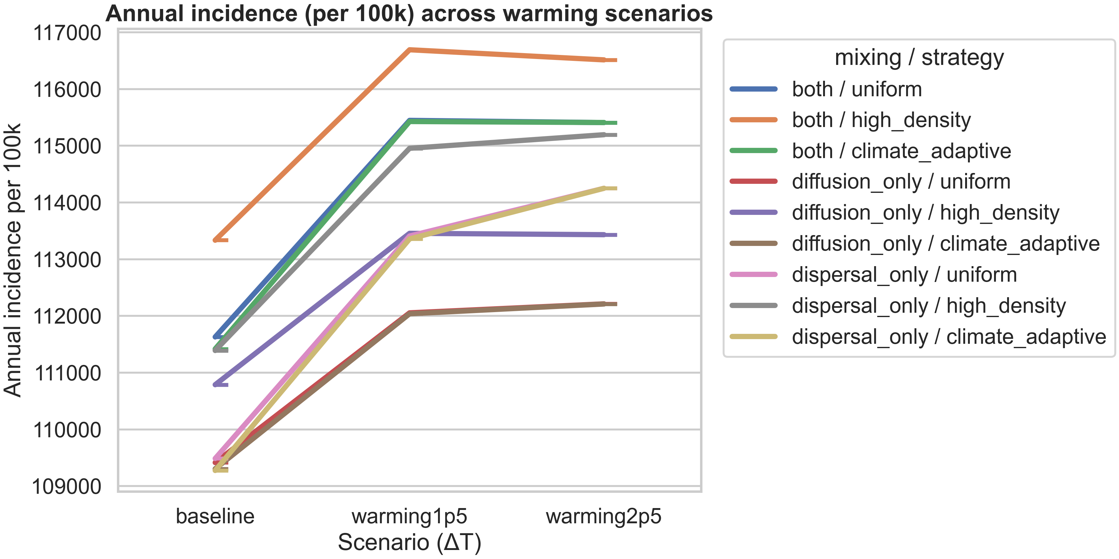
The figure above visualizes this finding, showing how annual incidence varies across warming scenarios for each mixing/strategy combination. All strategies show an increase from baseline to +1.5°C warming, with most plateauing or showing only slight changes from +1.5°C to +2.5°C. The high_density strategy consistently produces the highest incidence, while diffusion_only / uniform produces the lowest, reflecting how mobility patterns interact with allocation rules.
Finding 2: Seasonal forcing dominates over spatial heterogeneity in annual metrics
To understand which climate forcing mechanisms matter most, we ran an ablation study comparing different combinations of seasonal and spatial forcing, all at baseline temperature with uniform vaccination. The results are:
| mixing | forcing | annual_incidence_per_100k | final_cumulative_infections_per_capita | r0_hotspot_fraction_mean |
|---|---|---|---|---|
| both | none | 117275 | 1.15669 | 0.153846 |
| both | seasonal+spatial | 111630 | 1.10101 | 0.153846 |
| both | seasonal_only | 111650 | 1.10121 | 0.153846 |
| both | spatial_only | 117005 | 1.15402 | 0.153846 |
| diffusion_only | none | 113793 | 1.12234 | 0.230769 |
| diffusion_only | seasonal+spatial | 109416 | 1.07917 | 0.230769 |
| diffusion_only | seasonal_only | 109549 | 1.08048 | 0.230769 |
| diffusion_only | spatial_only | 113476 | 1.11921 | 0.230769 |
| dispersal_only | none | 116520 | 1.14924 | 0.153846 |
| dispersal_only | seasonal+spatial | 109488 | 1.07988 | 0.153846 |
| dispersal_only | seasonal_only | 109272 | 1.07775 | 0.153846 |
| dispersal_only | spatial_only | 116120 | 1.14529 | 0.153846 |
The key finding is that seasonal forcing dominates over spatial heterogeneity in these aggregated annual metrics. When you compare “seasonal_only” to “seasonal+spatial”, the differences are tiny (annual incidence differs by only ~20–200 per 100k, less than 0.2%). But when you compare “none” to “seasonal_only”, the differences are substantial (annual incidence drops by ~5,000–8,000 per 100k, a 4–7% reduction). This tells us that the seasonal temperature cycle is the primary driver of epidemic dynamics in this setup, while the spatial temperature anomaly (which is moderate in magnitude) has a smaller effect on annual totals.
However, this doesn’t mean spatial heterogeneity is unimportant—it just means that when you aggregate over a full year, the seasonal cycle averages out the spatial effects. The spatial heterogeneity still matters for understanding where outbreaks occur, how they spread, and how vaccination should be targeted. The fact that “spatial_only” (no seasonality) produces similar burden to “none” (no forcing at all) suggests that without the seasonal cycle, the spatial gradient alone doesn’t create enough temporal variation to substantially alter epidemic trajectories.
Finding 3: Mixing patterns change spatial occupation, feeding back into totals
The mixing ablation reveals how different mobility patterns affect epidemic outcomes. When you compare “both” (diffusion + dispersal) to “diffusion_only” or “dispersal_only”, you see that the mixing type changes how infections occupy space, which then feeds back into totals via spatially varying temperature and vaccination.
The r0_hotspot_fraction_mean column is particularly revealing: it’s 0.154 for “both” and “dispersal_only” but 0.231 for “diffusion_only”. This metric represents the fraction of the domain where $R_0 > 1$ on average, and the higher value for “diffusion_only” suggests that when you remove fat-tailed dispersal, infections spread more slowly and remain concentrated in hotspots longer, creating more persistent high-transmission regions. This spatial concentration then interacts with the temperature field and vaccination allocation to produce different aggregate outcomes.
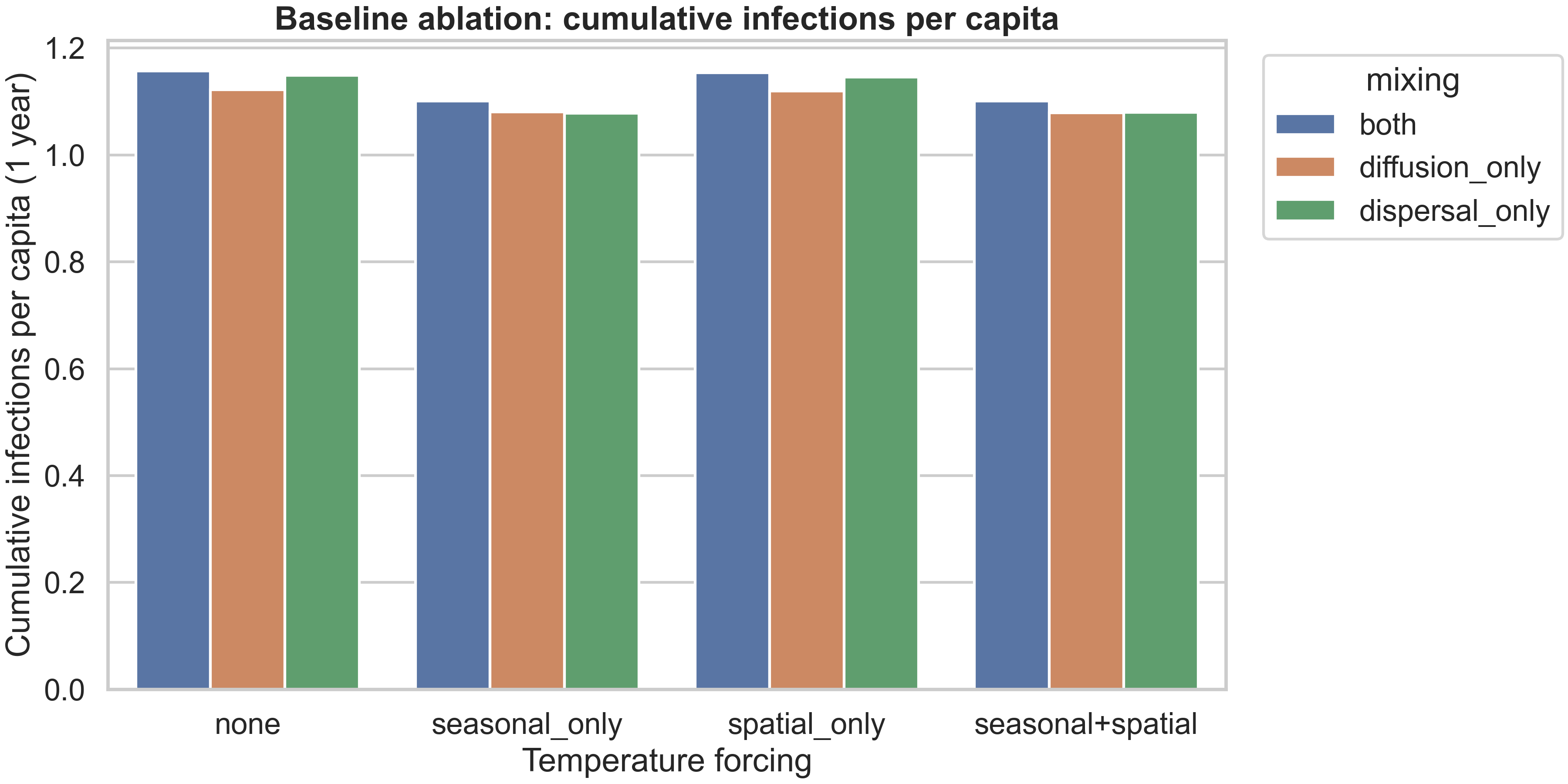
The figure above shows how cumulative infections per capita vary across forcing types and mixing patterns. The pattern is clear: seasonal forcing (either alone or combined with spatial) reduces burden compared to no forcing or spatial-only forcing, and “diffusion_only” mixing produces lower burden than “both” or “dispersal_only”. This reflects the fact that slower, more local spread (diffusion-only) allows vaccination and natural depletion to have more impact before infections reach new areas, while fast long-range dispersal (dispersal-only) can seed new outbreaks faster than interventions can respond.
Reproducibility: exact commands used for this post
If you want to reproduce the exact artifacts shown in this blog post, all outputs live under dengue_climate_model/results/. The baseline curated runs (the spatiotemporal and temporal plots) were generated with:
python dengue_climate_model/main.py --scenario baseline --strategy uniform
python dengue_climate_model/main.py --scenario baseline --strategy high_density
python dengue_climate_model/main.py --scenario baseline --strategy climate_adaptive
Numerical verification (the refinement comparison plot) was generated with:
python dengue_climate_model/verify_numerics.py --scenario baseline --strategy uniform
The experiment matrix (the systematic ablations across scenarios, forcing types, and strategies) was generated with:
python dengue_climate_model/run_experiment_matrix.py --tfinal 365 --grid 20 --dt 0.5 --save 30 --forcing all --no-plots
python dengue_climate_model/blog_artifacts.py --matrix-dir dengue_climate_model/results/experiment-matrix-20251226-184353
The second command processes the matrix results to generate the summary tables and figures. All tests can be run with:
pytest -q dengue_climate_model/tests
Limitations
This project is now in a strong methods-paper shape for synthetic analysis. The model is mathematically well-defined, the numerical scheme is verified, and the experiment matrix provides systematic evidence for how mechanisms interact. However, a journal reviewer will still ask for several enhancements before accepting it as a publication-ready contribution.
First, the mosquito–human coupling terms need clearer mechanistic calibration. The current mass-action form ($\lambda_h \propto \frac{S I_m}{N}$) is a reasonable starting point, but the scaling of human incidence with mosquito infection density and the choice of normalizations should be justified against empirical data or at least anchored to literature ranges. For example, what is the expected relationship between mosquito infection prevalence and human incidence? How does this vary with mosquito abundance? These questions require either data assimilation (fitting the model to observed time series) or at least a sensitivity analysis showing how results change as coupling parameters vary.
Second, sensitivity and uncertainty quantification should be expanded. The project already scaffolds Sobol sensitivity analysis, but a full treatment would show which parameters dominate qualitative outcomes (not just quantitative metrics) and how robust results are to forcing structure. For example, does the finding that “seasonal forcing dominates” hold across different seasonal amplitudes? Does the modest strategy difference persist under different dose budgets or spatial temperature patterns? These robustness checks are essential for making generalizable claims.
Third, even for a synthetic paper, some validation against literature ranges would strengthen the contribution. For example, does the $R_0(T)$ curve match known relationships from vector ecology studies? Are the incidence scales (e.g., annual incidence per 100k) plausible for dengue-endemic regions? These plausibility checks don’t require full data calibration, but they do require comparing model outputs to published ranges and explaining any discrepancies.
Fourth, for publication, each figure needs a single clear claim supported by the visualization. The current figures are rich and informative, but a journal version would benefit from more focused panels where each subplot makes one specific point, with supporting diagnostics moved to a supplement. This is partly a matter of presentation (reorganizing existing content) and partly a matter of running additional targeted experiments to fill gaps.
If you want to take this project to publication, the next step would be to extract this content into a paper/manuscript.md skeleton and iteratively refine the coupling assumptions and ablations so each figure makes one strong, defensible scientific point. The current blog post provides an excellent foundation for that process, with all the technical content and interpretation already in place.
Comments